My Approach
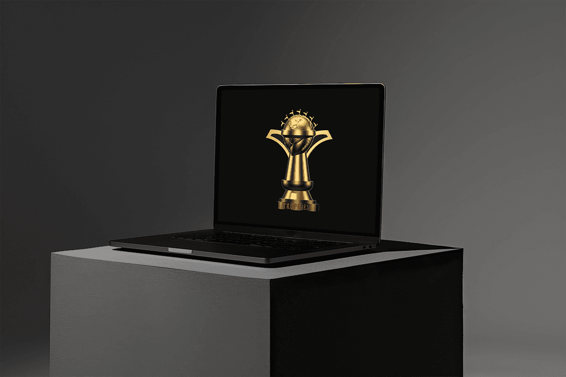
Creating the “Trophies” logo was an exercise in balancing complexity and clarity. The design concept centers on merging multiple trophies into a singular cohesive form, representing a blend of achievements, success, and versatility. My process prioritized a minimalist yet impactful approach, ensuring that the logo remains visually engaging across various applications. By thoughtfully considering shapes, symmetry, and negative space, I crafted a design that seamlessly symbolizes the concept of unity in success while maintaining a sleek and modern aesthetic.
Vision and Innovation
The vision for the Trophies logo was to encapsulate the idea of diverse accomplishments coming together in one harmonious representation. This required a creative approach to integrate multiple trophy designs into a single, unified shape. The innovation lies in the use of overlapping elements, gradients, and subtle dimensionality to create a dynamic yet elegant logo. By incorporating modern design techniques, such as abstract geometry and clean lines, the logo becomes not just a symbol but a storytelling piece that communicates excellence and multifaceted success.
Identifying Unique Challenges
1. Complex Integration: Combining multiple trophy designs without overwhelming the viewer or losing clarity.
2. Versatility: Ensuring the logo works well across various mediums and sizes, from digital screens to print and merchandise.
3. Symbolic Representation: Balancing aesthetic appeal with the deeper message of unity and achievement.
Resolving Complex Problems
1. Simplified Complexity: I used abstract shapes to represent the essence of each trophy, allowing for a unified and clean design.
2. Scalable Design: The logo was crafted with scalability in mind, ensuring that details remain clear at both small and large sizes.
3. Versatile Color Palette: A flexible palette allows the logo to adapt to various brand identities and applications, maintaining its impact regardless of context.
User-Centric Design
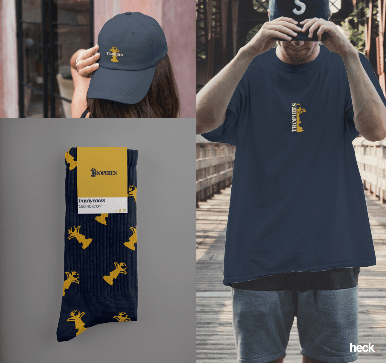
The Trophies logo is designed to resonate with a broad audience, from corporate clients to sports enthusiasts. It’s visually striking yet simple enough to be universally understood. The design anticipates its primary use cases—websites, branding materials, trophies, and merchandise—ensuring that it maintains its integrity and meaning across all applications. Every element, from its proportions to its typography pairings, was chosen to enhance the user’s connection to the brand it represents.
Meeting User Needs
The Trophies logo was designed to meet the following key user needs:
• Memorability: A distinct design that leaves a lasting impression.
• Flexibility: A logo that can adapt seamlessly to digital and physical formats.
• Symbolism: A visual representation of multiple achievements that aligns with the ethos of excellence and unity.
By addressing these needs, the logo serves as a powerful branding tool that communicates the values of the organization or individual it represents.
Detailed Design Features
1. Core Shape: The logo integrates the essence of multiple trophies into a singular form, balancing negative space with bold outlines for clarity and impact.
2. Dynamic Elements: Subtle gradients or shadows are incorporated to add depth and dimension without overwhelming the minimalist style.
3. Typography Pairing: Clean, modern typography complements the logo, enhancing its professional and versatile appeal.
4. Color Flexibility: A core palette of metallic tones (gold, silver, bronze) can be used, with optional variations for specific brand adaptations.
5. Scalable Design: The logo maintains its integrity across all scales, from favicon sizes to billboard applications.
Conclusion
The Trophies logo is more than just a design—it’s a celebration of achievement and a symbol of unity. By seamlessly blending multiple trophies into one cohesive form, the logo tells a story of success, versatility, and excellence. Its thoughtful design ensures that it adapts to various branding needs while maintaining its impact and clarity. Whether it’s used on a website, merchandise, or as a centerpiece for a trophy itself, the Trophies logo stands as a testament to the power of creative design in delivering meaningful and memorable branding.
